Why Times New Roman?
What is it with Times New Roman anyway?
Times New Roman was designed as a newspaper typeface, it was commissioned by the London based newspaper The Times. As a newspaper font it was designed to save space, to fit more text on a page, the glyphs are overall more compact, they are narrower in order to work with narrower columns, and they are more squat (the ascenders and descenders are shorter) allowing more lines of text to be printed. Unlike book typefaces, such as Garamond, which are designed to be printed on a finer paper stock, Times New Roman was designed to be printed on newsprint, its glyphs are stockier and are sturdier in order to withstand poorer quality newspaper paper stock.
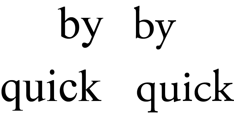
Times New Roman compared to Garamond, the quintessential book typeface
(Times is on the left, Garamond is on the right)
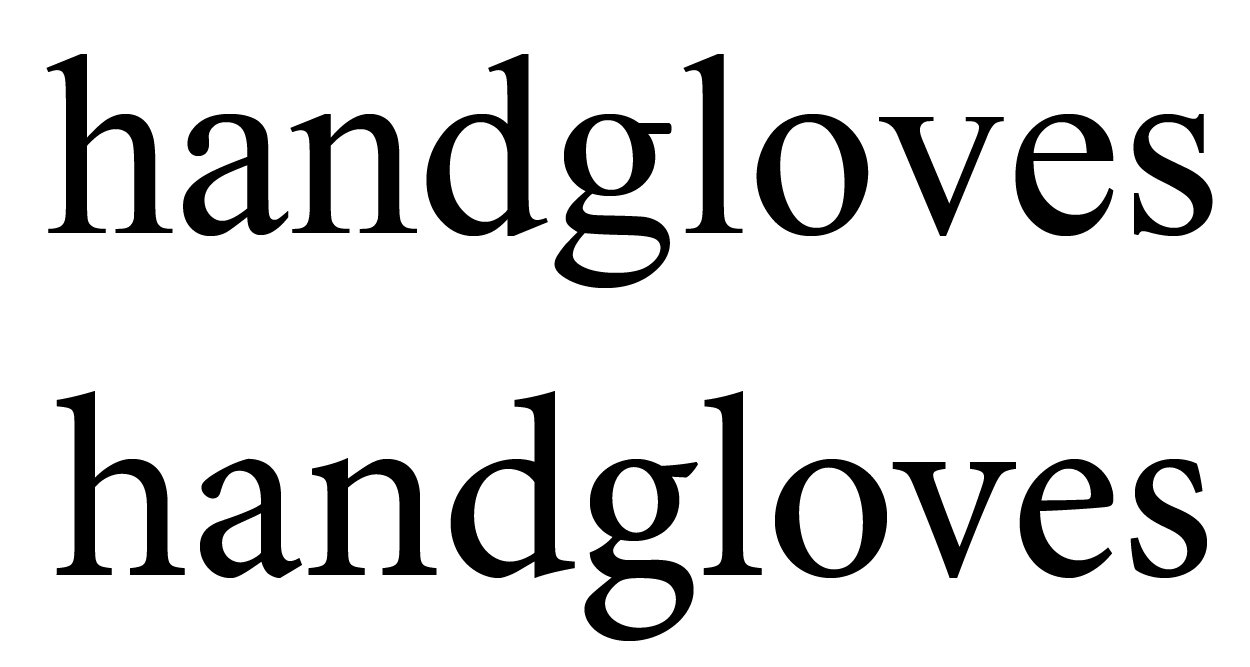
(In this comparison Times is on the top)
So, why did, how did Times New Roman become so prevalent? Partly out of typographic ignorance, partly out of widespread availability, partly because Apple and Adobe selected it as the serif font installed in the LaserWriter. And then Microsoft made it a Window's system font and the default font for Word, but the most likely reason is typographic ignorance, not understanding the difference between a typeface designed for efficiency and economy and one designed to facilitate reading comprehension.
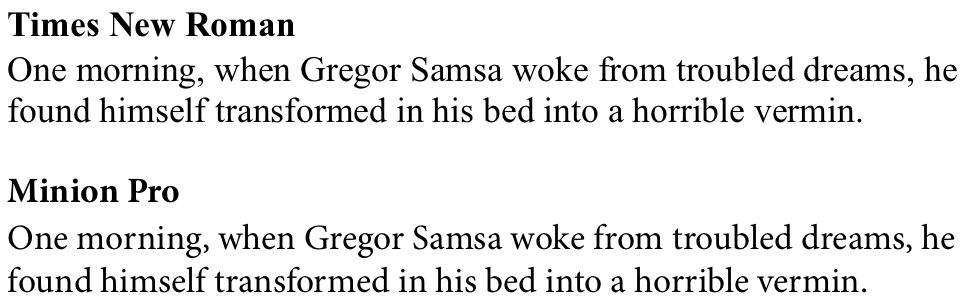
Times New Roman has more often then not been misapplied, there are far more suitable serif typefaces available. There's, as previously mentioned Garamond, and then there's Caslon, Baskerville, and Bembo. A more suitable alternative to Times New Roman is Minion Pro, it has similar metrics to Times New Roman meaning it takes up about the same amount of space on the page as Times. Because Minion's characters are not as condensed or as squat as Times' characters Minion is easier to read.
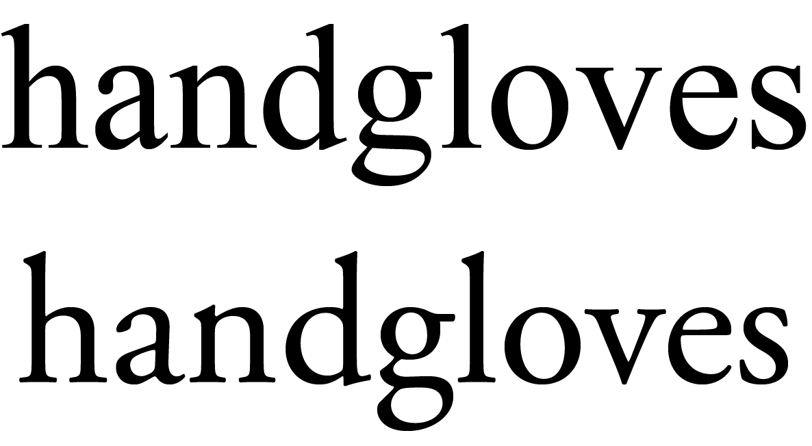
Comparisons of Minion to Times New Roman
(Times is on the top)