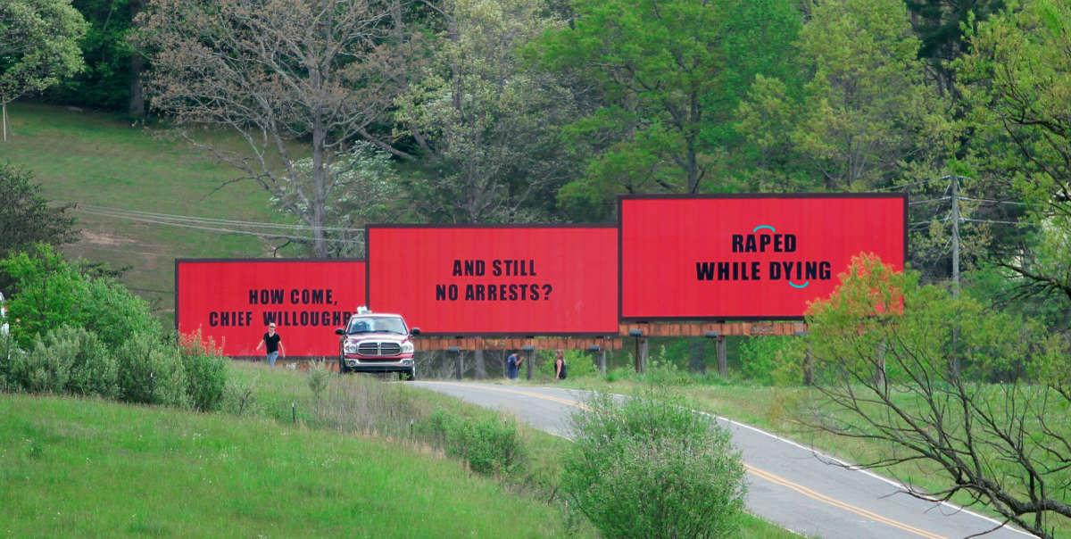
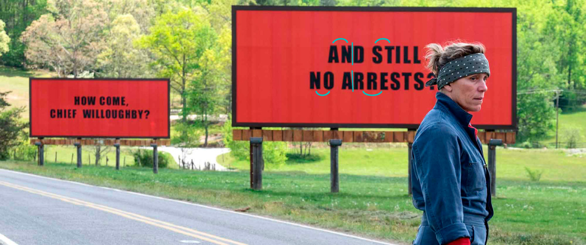
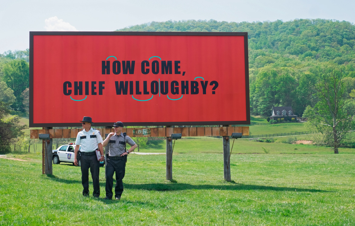
Three “Poorly Typeset” Billboards
I see this all the time, ads, posters, and yes, billboards that are not properly typeset, which I find extremely annoying. This is mostly the result of lazy and/or ignorant “designers” who type text into a computer and think that Photoshop or Illustrator will magically set the type for them. In most instances, and with the proper settings, Photoshop/Illustrator will do a good job of letter spacing, that is, if the font being used has good kerning tables. Now as far as the Three Billboards Outside Ebbing, Missouri is concerned the typesetting of the font Impact is so atrocious I can’t believe that no one along the production chain notice it.
I’ve marked where the letter spacing is either too loose ⋂ or too tight ∣ …