The Impact of Impact*

A review of Realist Sans typefaces

I recently came across an article on Vox about that “bold, white, all-caps font” called “Impact,” the typeface used on all those internet photo memes. The article and its accompanying video present a history of Impact, and its place in the typography of its period, but the history presented in the article is misleading and includes historical inaccuracies and omissions. It lacks an understanding of 20th typography in general and postwar Swiss (International Style) typography in particular. It implies that Impact was somehow the sole typeface of this class of typefaces when in fact it followed a line of faces stretching back a decade before it. It leaves out one of the motivating factors for Monotype's acquisitions of Impact in 1965, it was looking to compete with Linotype’s Helvetica Inserat which had dominated the market since its publication in 1957 (Inserat is German for a form of advertising, such as a newspaper insert). Both Inserat and Impact belong to a group of typefaces designed from the mid 50s to the mid 60s known as Realist Sans, from the legendary Schmalfette Grotesk (1954) to Helvetica Inserat (1957) to Folio Bold Condensed (1963) to Compacta (1963) [a personal favorite, (see below)] to Impact (1965) to the Matthew Carter designed Helvetica Compressed (1966).

Comparison of Inseret and Impact

Geoffrey Lee claimed Impact was influenced by Schmalfette Grotesk but I contend that Helvetica Inserat was the more obvious influence.

Impact v Inserat
Impact v Inserat

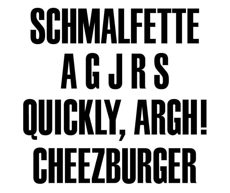
This is Schmalfette Grotesk (Schmalfette from German: schmal 'condensed' + fette 'bold'), the original Realist Sans. This legendary typeface was drawn in 1954 by Swiss designer Walter Haettenschweiler and became very popular amongst graphic designers but was notoriously difficult to get outside of Switzerland, why, in all my research I have not been able to ascertain the reason.

Schmalfette Grotesk

In the article the author states that Impact is “similar to its close cousin Haettenschweiler” but had the author done any cursory research at all he would have found that Haettenschweiler is not Impact's cousin, but its "uncle," its mother's boyfriend, a second rate, poorly drawn, bastardized version of Schmalfette Grotesk. Haettenschweiler is clunky and lacks the original's elegant curves and balanced proportions. [Note: Haettenschweiler is brought to you by the same people, Monotype and Microsoft, who brought you that bastardization of Helvetica called Arial.]

Schmalfette Grotesk vs Haettenschweiler

Because Schmalfette Grotesk did not have lowercase letters I uppercased Haettenschweiler to better compare the two

Helvetica Compressed was designed by Matthew Carter, of Verdana and Georgia fame, in 1966 to be "in practice similar to Schmalfette Grotesk" and it is significantly dissimilar enough from Helvetica Narrow and Condensed that is not sold as part of the Helvetica Family.

Helvetica Compressed
The video also perpetuates a common misconception about which newspaper the "Times" in Times New Roman is referring by graphically implying that it refers to "The New York Times" when in actuality it was created for "The Times of London" by Monotype London under the direction of Stanley Morison (Eric Gill, the designer of Gill Sans, was on the design team). Even Apple made that erroneous assumption in the naming of its original bitmap fonts for the Mac, the, as Steve Jobs called them, "World Class cities" font names of Chicago, New York, Geneva, Monaco, London, San Francisco, Toronto, and Venice. Their bitmap version of Helvetica was appropriately called Geneva (although, to be really precise, the type foundry, Haas Type Foundry, that first published "Neue Haas Grotesk" was located outside Basel, Switzerland not Geneva) but Apple called their the bitmap version of Times "New York" instead of the more accurate "London".
Times New Roman

One more nitpicky thing about the video, he makes the all too common mistake of mispronouncing the name of the typeface Univers, designed by the great Adrian Frutiger. It's French for universal and is pronounced o͞on-ē-vāre, not yo͞on-ĕ-vers.

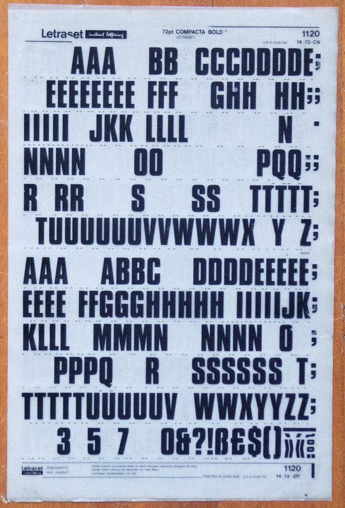
Compacta was designed by Fred Lambert for Letraset in 1963, and other then the original metal cut of Impact it is the only one of the Realist Sans that came in multiple weights, and two of the weights, regular and bold, were offered in oblique versions. Letraset offered it as one their Instant Lettering (view example) typefaces, sheets of dry transfer lettering, kind of like decals, that allowed one to set type. Because the sheets were inexpensive Letraset became very popular amongst small design firms and amateurs, it was desktop publishing before desktop publishing.
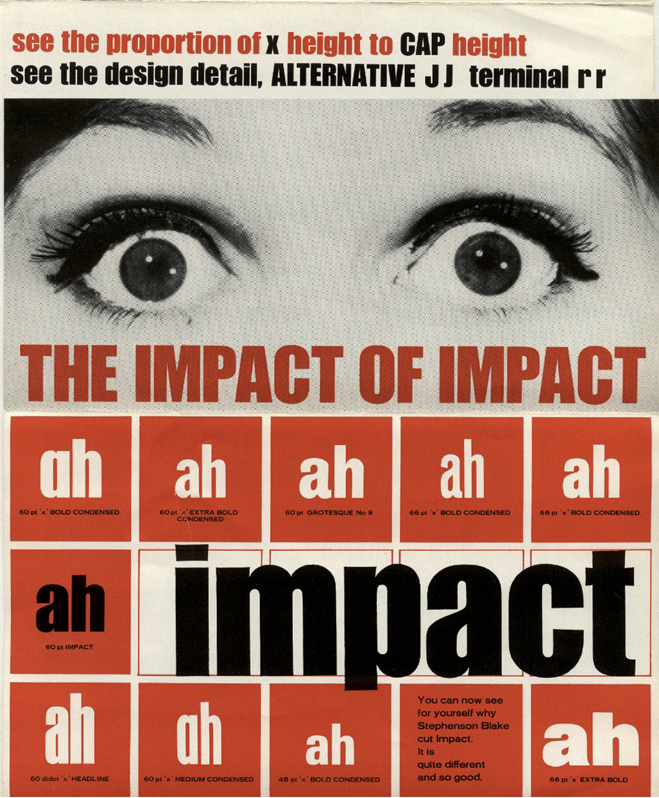
Compacta
Compacta Black

* The title is taken from the cover page of the original brochure for Impact (it is said this is a scan of Lee's personal copy)... 🔝

Notice the different weights and widths of the original. There was also single bowl alternatives of the lowercase "a" and "g".

Impact brochure

Impact brochure