
(,la) A Typographical Analysis
Here's my take on the ,la (comma-la) phonetic meme.
After looking over the various versions of the meme online (baseball caps seem to be the most popular items for sale) I found that they either use traditional serif fonts such as Baskerville or slab serifs such as Chaparral, or they simply resort to some script font.
But the one thing they have in common is the use of bold versions of the fonts, the clunky bold weights that lack the elegance that the meme calls for.
I'm assuming this stems from a lack of typographic sophistication.
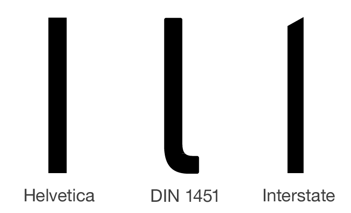
I'm also assuming that in the case of sans-serifs they run into the conundrum that the stems of both the lowercase <l> (the twelfth letter in the alphabet) and the uppercase <I> (the ninth letter in the alphabet) are monolinear,
and except for subtle design differences that are only discernable at larger font sizes*, they have the same vertical visual weight making it difficult to discern between the two.
* The capital letter <I> follows the strock width of other capitals which are as a rule thicker then the lowercase, the minuscule, letters.
The lowercase <l> follows the ascender height of the other letters with ascenders <b>, <d>, <f>, <h>, <k> which are slightly higher then the capital letters, the cap height.
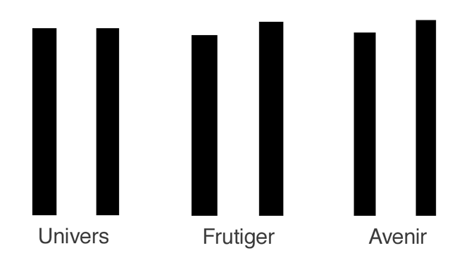
The image below uses three of Adrian Frutiger's more influential typefaces to illustrate these design differences,
Univers (1957) the other Helvetica, published in the same year, influenced by the same sans-serif grotesque typeface of the late 1890s Akzidenz-Grotesk,
Frutiger (1976) arguably one of the most influential typefaces of the 20th century, it created a whole new category of type, Humanist-Grotesque,
and Avenir (1988) a geometric typeface that was more organic, less structured then the previous Bauhaus era geometrics like Futura.
On the left of each pair of letters is the capital <I>, and on the right is the lowercase <l>...

Signage typefaces like those used on highway signs avoid this confusion by either cutting an angled slice at the head of the stem of the <l> or by adding a spur at the foot of the stem of the lowercase <l>.
Below is my version of the ,la (comma-la) phonetic meme. The font used is Corpid designed by the Dutch type designer Luc(as) de Groot who also designed the Microsoft fonts Calibri and Consolas. Corpid was influenced by the typeface Frutiger designed by Adrian Frutiger for the signage of Charles de Gaulle Airport. Corpid has a more elegant look and feel then those clunky, clumsy looking slab-serifs that are commonly used for this phonetic meme.

I did a version using Corbid Regular and one using Corpid Light. I rendered the comma in both versions 4% larger in order to make it a little more prominent but not too much larger that it compromises the integrity of the font's design.